
Table of Contents
Introduction: If Your Site Feels “Meh,” Users Bounce (Fast)
Here’s the brutal truth: if a website loads slowly, hides important actions, or looks like every other template, people leave. This guide explains how custom web development enhances user experience by making your site faster, clearer, and easier to use. You’ll see how a tailored build improves page speed, accessibility, information architecture, and mobile comfort—so visitors can complete tasks quickly and happily. Along the way, we’ll use simple language, real examples, a case study, and a practical plan you can follow. Expect useful, current advice on site performance, accessibility, mobile-first design, Core Web Vitals, personalization, and conversion optimization—all focused on results.
“Great UX reduces effort per task. Less effort = more conversions.”
What “Custom” Really Means (Not Just Changing Colors on a Theme)
Custom web development is a tailored build that matches your content, brand, and users—not a theme with swapped colors. It includes a purposeful architecture (SSR/SSG/ISR where it fits), a reusable design system, a lean asset pipeline (modern images, small JS), and a CMS structure that mirrors your information architecture. The point isn’t to be fancy; it’s to help users finish tasks faster with less cognitive load. When you control your components, markup, and payload sizes, you ship a site that’s fast, accessible, and easy to navigate, which naturally improves engagement, retention, and SEO.
How Custom Web Development Enhances User Experience (The Big 6)
1) Speed by Design (Core Web Vitals ≠ Optional)
Custom builds a plan for speed from day one. Only critical CSS ships at first paint; non-critical JavaScript waits its turn. Fonts are preloaded to avoid layout jumps. Images use modern formats (WebP/AVIF), responsive srcset, and lazy loading. Each page’s rendering (SSR/SSG/ISR) is chosen to balance freshness and speed. Teams set a performance budget (for example, keeping initial JS under ~200–250KB) so bloat doesn’t creep in.
Result: Users feel the site is instant; businesses see lower bounce and higher conversion.
2) Clear Information Architecture (IA) That Mirrors User Goals
Templates often push content into generic slots. Custom IA maps navigation and pages to jobs-to-be-done. Top tasks appear above the fold with honest, plain labels (no “clever” names that confuse). You add wayfinding: breadcrumbs, an in-page table of contents for long reads, and “related” modules.
Result: Fewer clicks to the goal and a structure that search engines can crawl and understand (hello, rich snippets).
3) Accessibility (A11y) Baked into Every Component
Accessibility is engineered into the design system, not bolted on at the end. Use semantic HTML first; add ARIA only when it adds meaning. Ensure visible focus states, keyboard access, and color contrast. Forms should provide clear labels, inline validation, and error summaries. Media needs captions/transcripts; images need descriptive alt text.
Result: Everyone can use your site—including screen-reader users—while you improve trust and reduce risk.
4) Personalization Without the “Creepy”
Custom logic makes the site feel relevant without violating privacy. Keep it simple: shift CTAs by geography or referrer, remember small session preferences (dismissed banners, saved filters), and tune on-site search with synonyms and “did you mean?”
Result: Feels helpful, not invasive. You get more qualified actions (demo requests, adds-to-cart, newsletter signups).
5) Mobile-First for Real-World Devices and Networks
Custom layouts start with phones, not “shrunk desktop.” Ensure thumb-friendly tap targets (≈44px), minimal inputs with autofill, and device-appropriate assets. Build for mixed bandwidth (2G/3G happens).
Result: Smooth on any device and better mobile rankings.
6) Trust Through Micro-Interactions (The Small Stuff That Wins)
Use motion to clarify—not distract. Skeleton loaders show progress; inline validation fixes form errors early; empty states explain what to do next. Motion should support meaning and respect “reduce motion” preferences.
Result: Higher confidence, fewer drop-offs, smoother funnels.
The Stack That Serves Humans (and Search Engines)
Rendering & Delivery: SSR, SSG, ISR (and when to use them)
- SSG/ISR for blogs, docs, and marketing pages—fast and cacheable.
- SSR for pages that need fresh per-request data or login-aware content.
- Use client-side rendering sparingly for truly app-like moments.
Pair this with a global CDN, long-lived caching where safe, and an image CDN for automatic resizing and format negotiation.
Data & CMS: Content Modeling That Mirrors IA
A headless CMS with content types that match your IA (e.g., Solution, Industry, Product, Case Study, Article, FAQ) lets editors move quickly without breaking layouts. Add preview, scheduled publishing, and versioning.
Design System: Consistency, Speed, and Fewer Regressions
Build a component library (buttons, inputs, modals, cards, and tabs) with accessibility and performance standards baked in. Store docs and examples; require a11y/perf checks in CI before merges.
How Custom Builds Support SEO
Good UX supports good SEO. Fast pages reduce bounce and increase engagement. Clear IA helps bots understand your site and show better snippets. Clean markup and consistent headings improve scanning. A custom build doesn’t replace content strategy; it enables it by giving you a fast, accessible, structured foundation.
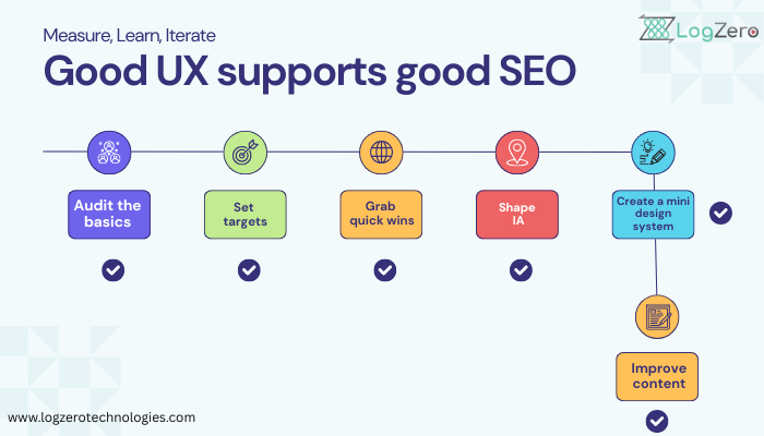
Simple, Real-World Plan (You Can Start This Week)
- Audit the basics: speed, mobile layout, nav labels, forms, and accessibility.
- Set targets: “Cut LCP in half” or “Increase demo requests by 25%.”
- Grab quick wins: compress images, inline critical CSS, defer non-critical JS, and standardize nav labels.
- Shape IA: map pages to user tasks; add breadcrumbs and in-page ToC for long content.
- Create a mini design system: start with buttons, form inputs, and card layouts; make them accessible and fast.
- Improve content: short paragraphs, H2/H3 structure, helpful visuals with alt text.
Measure, learn, iterate: track Core Web Vitals + conversions; run small A/B tests on CTAs, headlines, and layout order.
Mini Case Study (Hypothetical but Realistic)
A SaaS marketing site rebuilt with a performance budget, image CDN, clean IA, a11y-first components, and stronger content structure saw:
- Largest Contentful Paint (LCP): 4.8s → 2.1s
- Bounce Rate: 62% → 41%
- Conversion Rate: 1.3% → 2.7%
- Avg. Session Time: 1.9 min → 3.2 min
What changed? Critical CSS, deferred JS, modern image formats with responsive srcset, simplified nav labels, a “proof bar” near the CTA, and FAQ schema to target featured snippets.
Clarity Table: Before vs After Custom Web Development
| Metric | Before | After | Impact |
| Largest Contentful Paint (s) | 4.8 | 2.1 | Faster first view |
| Bounce Rate (%) | 62 | 41 | Fewer drop-offs |
| Conversion Rate (%) | 1.3 | 2.7 | Higher revenue/leads |
| Pages per Session | 2.1 | 3.4 | Deeper engagement |
| Avg. Session Time (minutes) | 1.9 | 3.2 | More content viewed |
Note: These are illustrative—but achievable—when you enforce budgets, optimize images, simplify IA, and ship accessible components.
Examples You Can Copy (Service, Blog, Product)
Service Page (Lead Gen)
- Above the fold: clear promise + one primary CTA
- “Proof bar” with logos, ratings, or quick stats
- Short benefit list (3–5 bullets) + a mini FAQ
- Sticky CTA or visible header CTA on scroll
Blog Post (Education/SEO)
- Start with a one-paragraph summary and estimated read time
- Add a small Table of Contents for long posts
- H2/H3 structure with short paragraphs and visuals
- End with “What to read next” (internal links)
Product Page (E-commerce)
- Show primary image, price, and main CTA immediately
- Tight value bullets; highlight delivery/returns
- Real reviews with filters
- Back-in-stock or “notify me” to capture demand
What to Measure
- Experience: LCP (first content you care about), INP (interaction responsiveness), CLS (layout stability)
- Behavior: bounce rate, pages/session, scroll depth, time to first key action
- Business: conversion rate, AOV or ARPU, qualified leads/pipeline
- Quality: support tickets about “can’t find X,” form error counts, and cart abandonment
Tip: Fix the worst URL groups first, and retest monthly. Track field data (real users), not just lab tests.
Common Questions
How do I know if my site needs a custom rebuild?
If your site feels slow, looks generic, or is hard to update—yes, it’s time. If your navigation confuses people or mobile is clumsy, a custom rebuild usually pays off quickly.
Can I personalize without annoying users?
Yes. Stick to context, not surveillance. Adjust CTAs by page, remember small session preferences, and tune on-site search. Make it helpful, not creepy.
What’s the difference between SSR, SSG, and ISR in plain English?
- SSG: pages are prebuilt at deploy time.
- ISR: Some SSG pages refresh on a timer.
- SSR: pages render on the server when requested.
Use each where it fits best (content vs. real-time data vs. personalization).
Do I need a design system?
If you have more than a handful of pages or plan to grow, yes. A small component library with accessibility baked in keeps you consistent and fast.
Q: What’s the fastest way to improve UX this month?
A: Reduce load and render cost: compress and lazy-load images, inline critical CSS, defer non-essential scripts, and preload key fonts. Expect faster first paint and interaction, lower bounce, and better conversions.
Q: What Core Web Vitals should I target?
A: Aim for LCP ≤ 2.5 s, INP ≤ ~200 ms, and CLS ≤ 0.1 for at least 75% of visits. These thresholds indicate a “good” experience and align your site with modern performance expectations.
Q: Do animations help or hurt UX?
A: They help when they explain the state (loading, success, errors) and remain short. Respect reduced motion preferences and never block input.
Q: Is a custom build always better than a premium theme?
A: Not for micro-sites. But if speed, accessibility, unique flows, or scale matter, custom typically pays off in conversion lift and easier long-term maintenance.
Conclusion: Custom = Faster, Clearer, Kinder to Users
Custom web development enhances user experience by engineering speed, clarity, accessibility, and relevance into your site. That means less effort per task, happier visitors, and better results: lower bounce, higher conversions, and stronger SEO. Start with a quick audit, set a performance budget, model content around real tasks, and keep iterating. This steady, practical approach beats one-off redesigns every time.
